role:
product designer
timeline:
3 weeks
tools:
figma
type:
concept project
responsibilities
research
information architecture
wireframing
ui design
prototype
design system



role:
product designer
timeline:
3 weeks
tools:
figma
type:
concept project
responsibilities
research
information architecture
wireframing
ui design
prototype
design system
Designing a unified experience for modern gamers
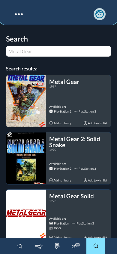
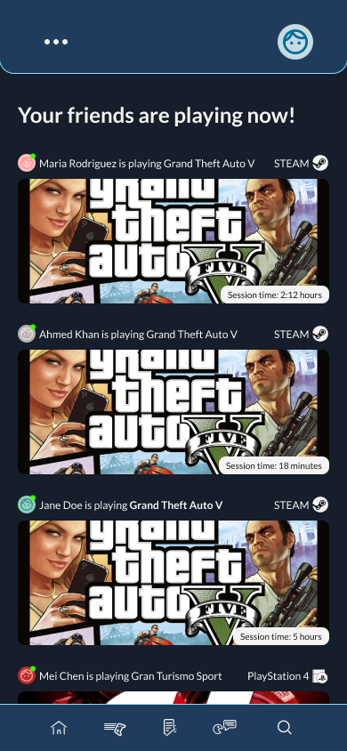
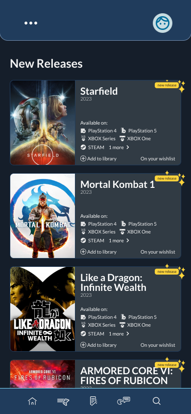
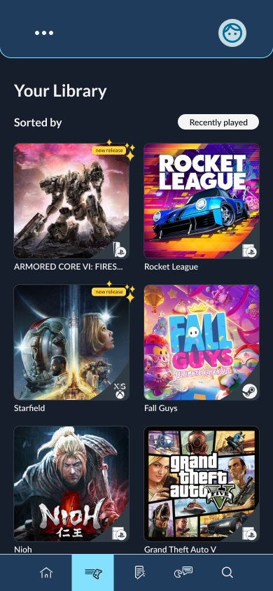
Game Track is a conceptual mobile app that brings games, achievements, wishlists, and friends from multiple platforms into one seamless experience.
Instead of building another storefront, the project focused on creating a scalable interface that organizes a complex ecosystem through familiar patterns and thoughtful information architecture.
Design Challenges
The main challenge wasn't designing beautiful screens, it was organizing a huge amount of cross-platform information without overwhelming the user.
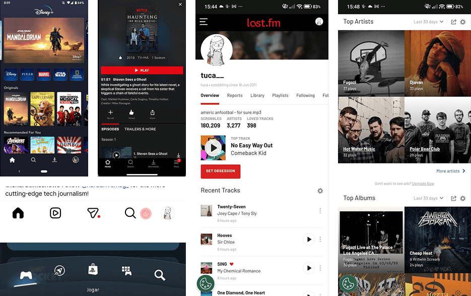
Instead of searching for a direct competitor, I analyzed products that successfully solved individual aspects of the experience.
Streaming platforms inspired the organization of extensive content libraries, allowing users to browse large collections without feeling overwhelmed.
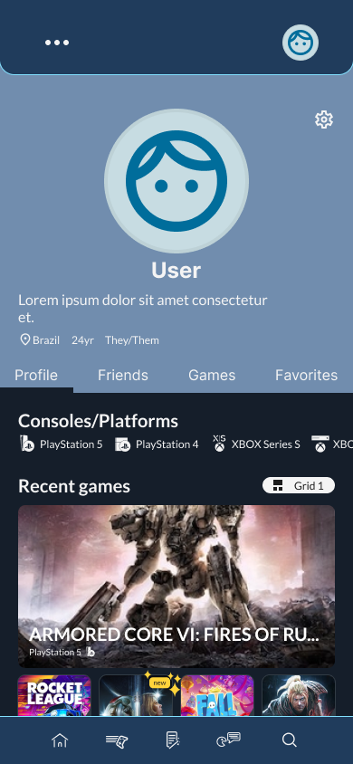
Social platforms demonstrated how activity feeds and personal profiles encourage engagement and community interaction.
Gaming platforms provided familiar navigation patterns that players already understand, reducing the learning curve while keeping the interface intuitive.
Rather than copying a single product, the final experience combines interaction patterns users already know into a solution designed specifically for gaming.

The project was guided by a simple objective: make a feature-rich platform feel effortless to navigate.
Prioritize Familiarity
Instead of introducing new interaction patterns, the interface builds on conventions users already know.
Reducing friction lets users focus on their games—not on learning the interface.
Surface information progressively
Showing every available feature at once would make the application intimidating.
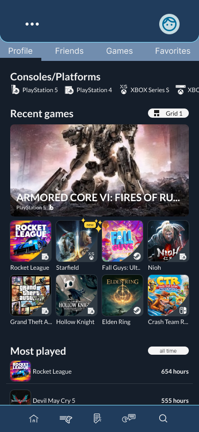
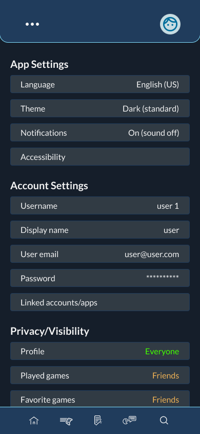
Instead, information is revealed progressively through expandable sections, categorized content and contextual actions, allowing users to focus only on what matters at that moment.
Make discovery effortless
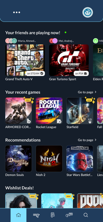
The home screen was designed to answer the questions players ask most frequently.
Instead of forcing users to search for these answers, the interface brings them directly to the main screen.
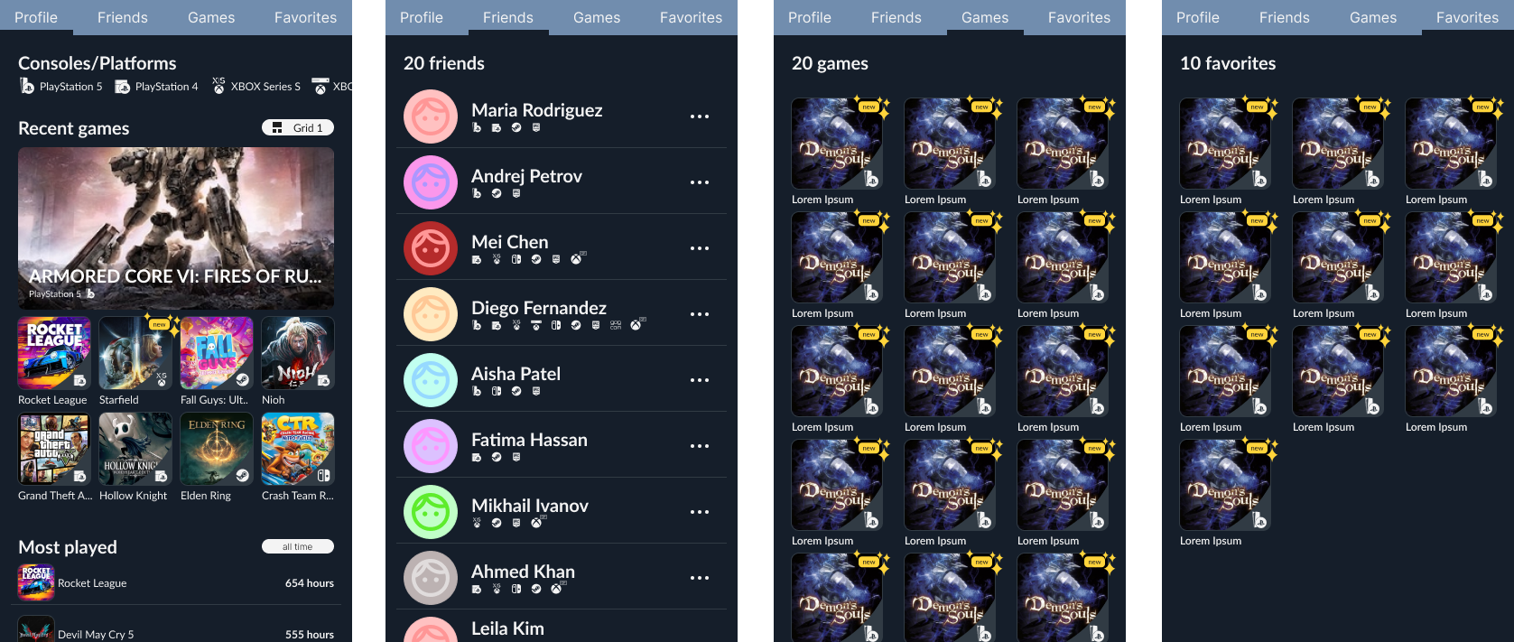
Build a Scalable System
Gaming libraries constantly evolve, so the interface was built to grow with them.
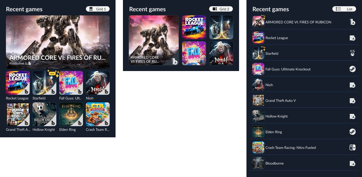
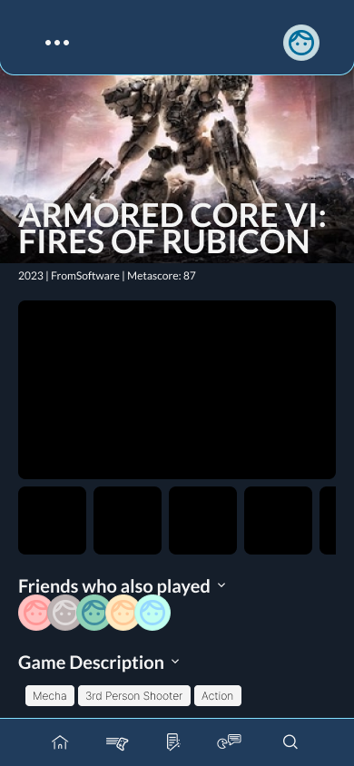
Game pages combine trailers, screenshots, reviews, achievements, pricing, DLC, and recommendations. The challenge was presenting all of this without overwhelming users.
The result is an interface that remains easy to scan regardless of content density.
Navigation was designed around user goals rather than application structure.
Consistent navigation patterns reduce decision-making and encourage exploration.
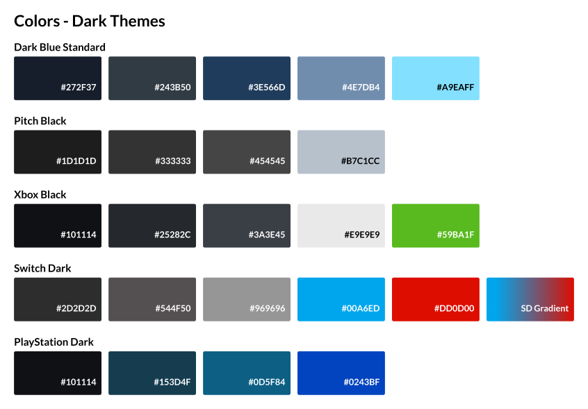
The visual language puts game artwork first while maintaining a clean, readable interface.
This project shifted my perspective from designing individual screens to designing information systems.
If revisiting the project today, I would validate these decisions through usability testing and accessibility reviews before expanding the system further.