role:
ux/ui design
timeline:
3 weeks
tools:
figma
type:
concept project
e-commerce
responsibilities
research
information architecture
wireframing
ui design
prototype
design system
responsive design



role:
ux/ui design
timeline:
3 weeks
tools:
figma
type:
concept project
e-commerce
responsibilities
research
information architecture
wireframing
ui design
prototype
design system
responsive design
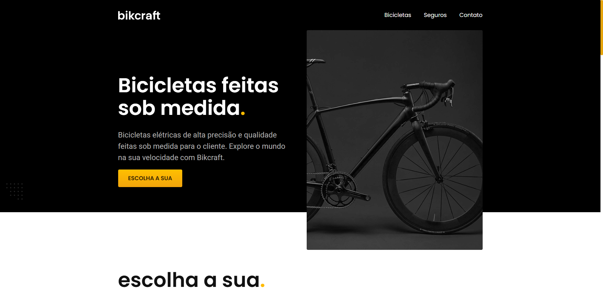
Designing a component-first e-commerce system
Bikcraft is a concept project that explores how a fictional high-end bicycle manufacturer could present complex products through a clean, component-based interface.
The focus was on building a reusable UI system that keeps the shopping experience clear and consistent across product listings, detail pages, insurance plans, and marketing content.
Design Challenges
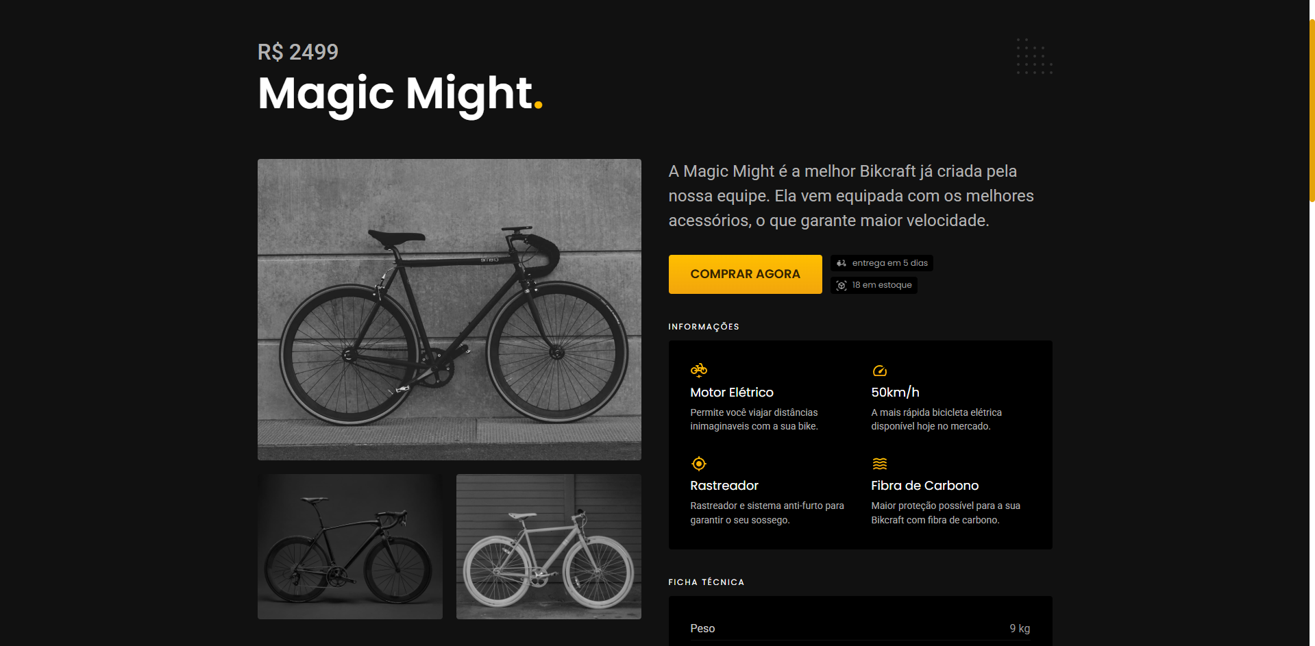
The main challenge was presenting detailed product specifications without overwhelming the user, while creating a visual language that felt premium and cohesive.

E-commerce for technical products requires showing a lot of information such as materials, specifications, customisation options, without turning the page into a dense catalogue.
The project explored how to make that complexity feel effortless:
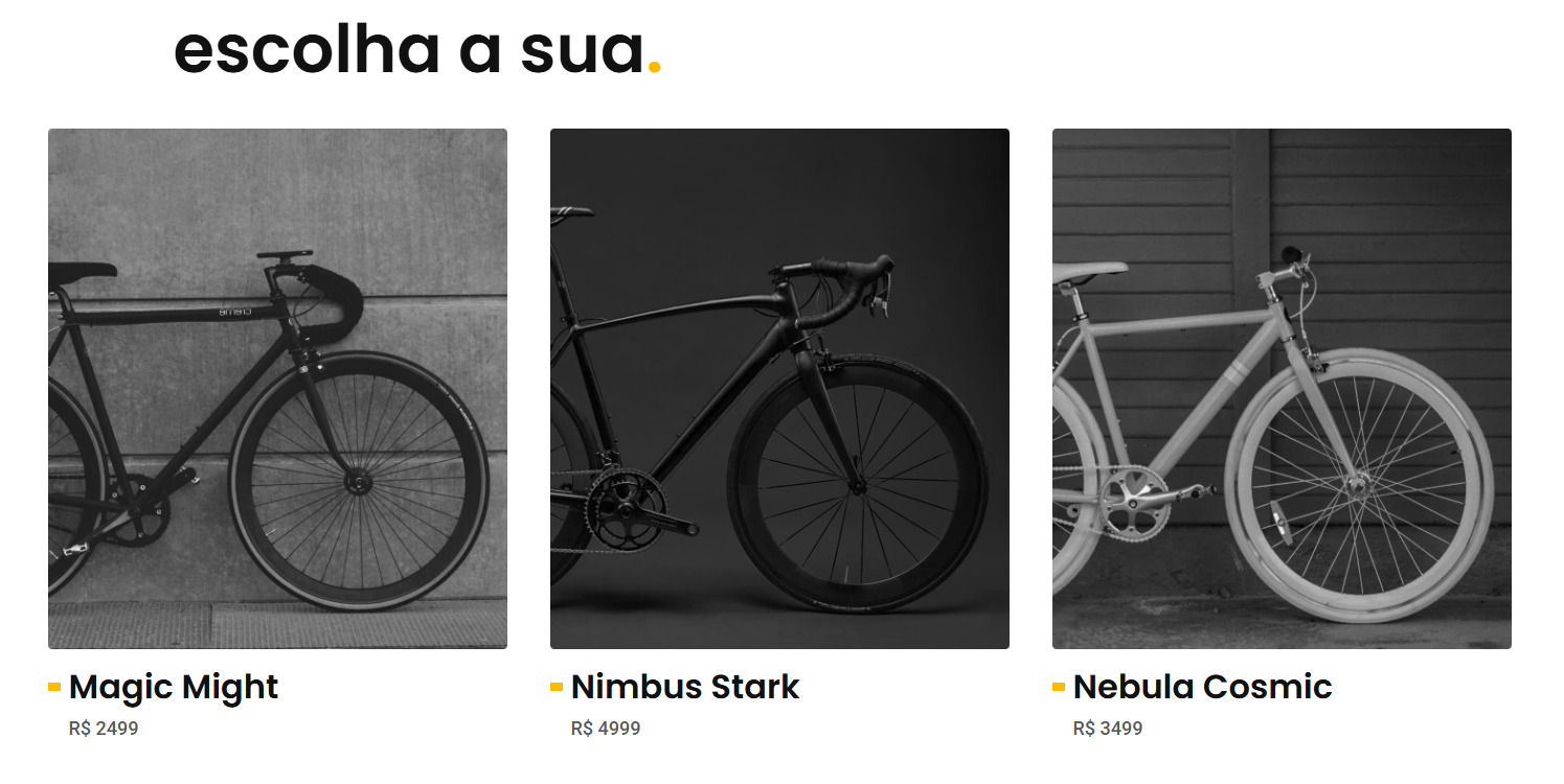
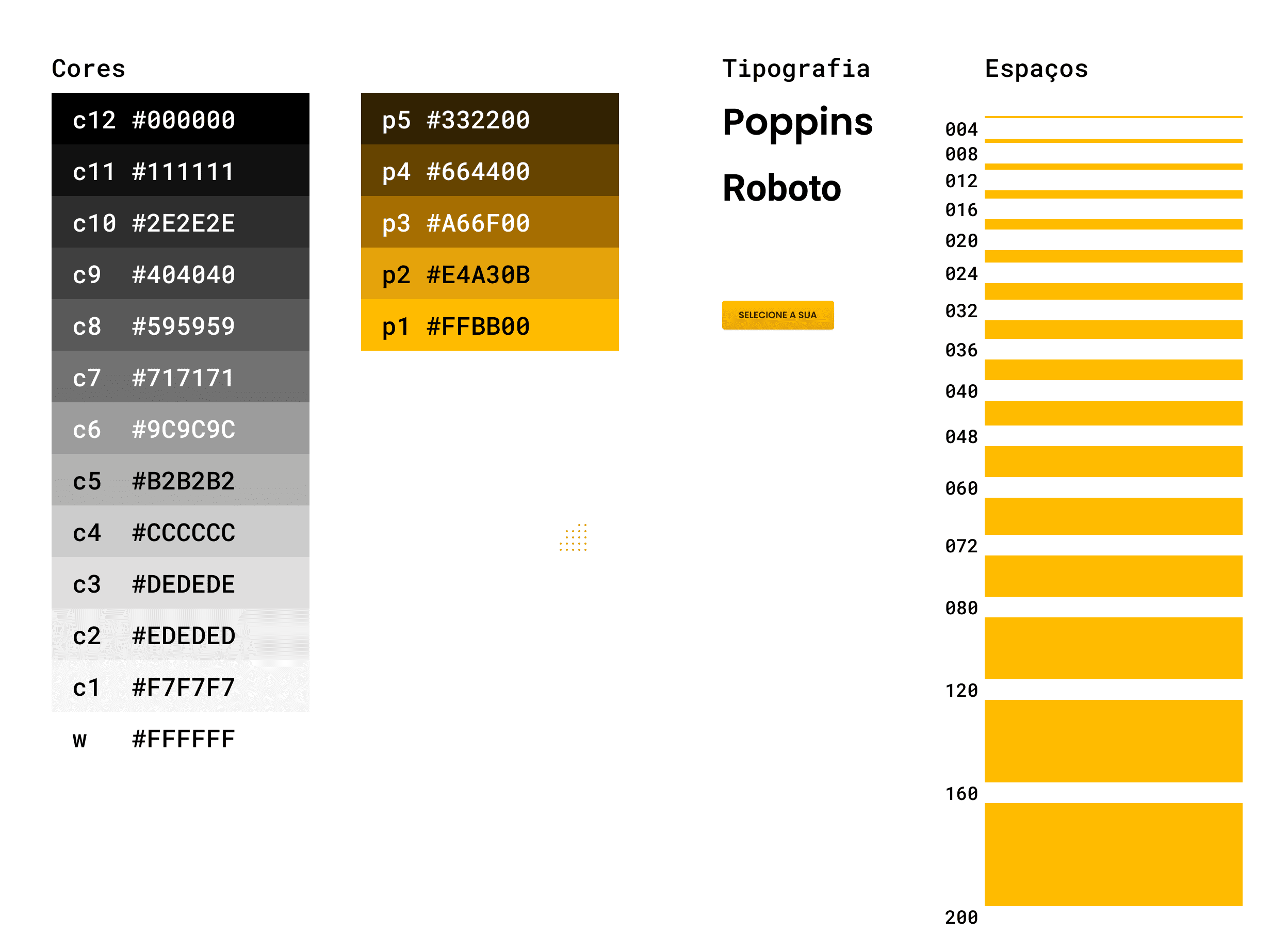
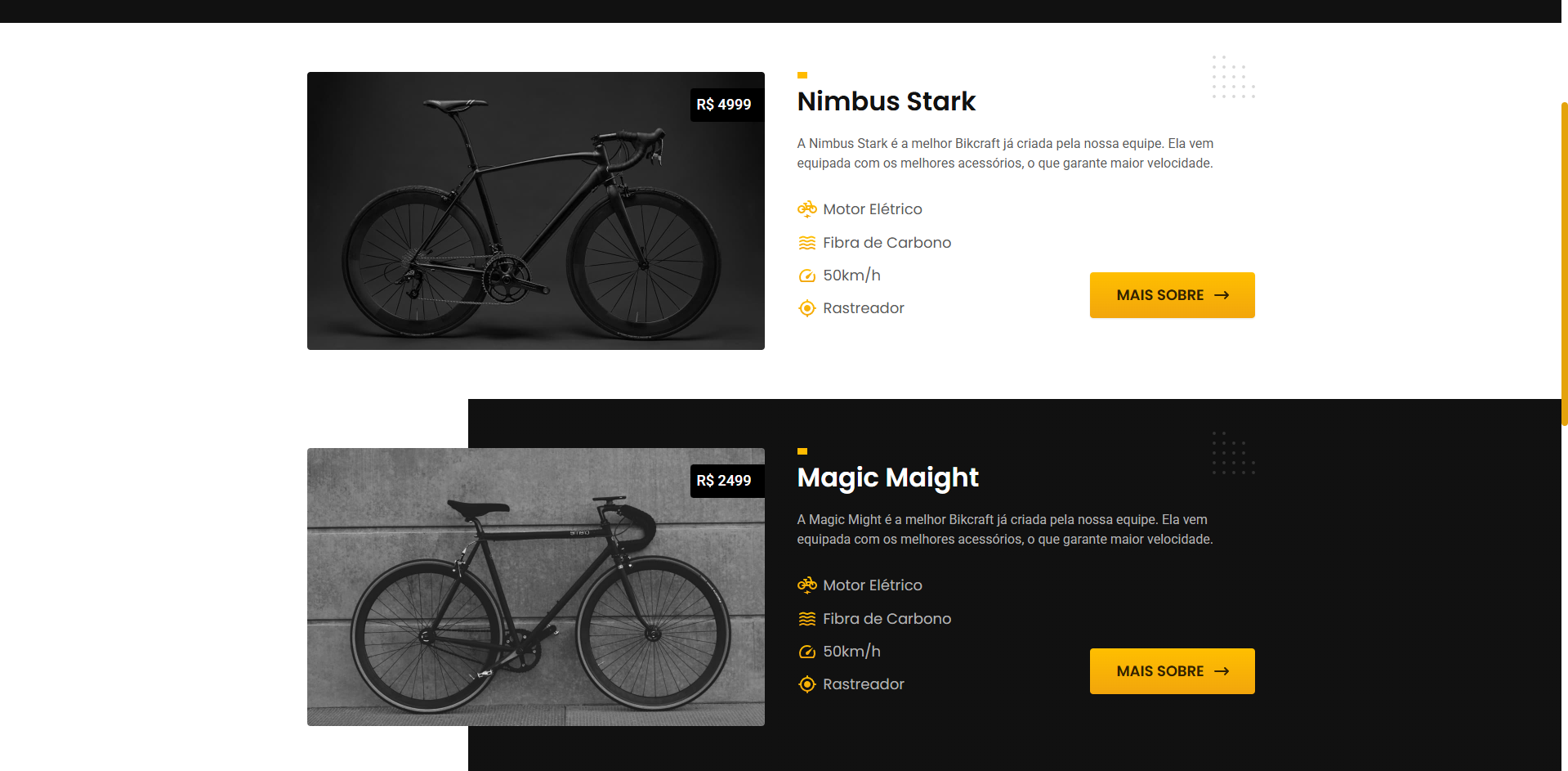
I built the interface around a component-first design system, shared buttons, cards, typography, and spacing rules that could be assembled quickly into different page layouts.
Inspiration from modern D2C brands helped set the tone: bold typography, generous whitespace, and restrained colour that puts the product first.
The design system was built to grow: new products, categories, or even a completely different sub-brand could be added later without breaking the visual language.
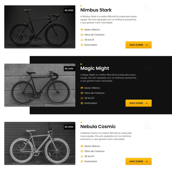
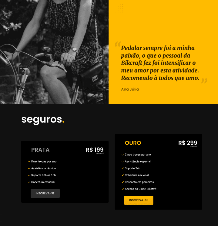
Pages were organised around the customer’s natural journey: discover, compare, configure, and purchase.
Key sections include:
A strong grid, consistent spacing, and clear typographic hierarchy make even dense information easy to scan.
The final result is a polished, premium browsing experience that feels as engineered as the bicycles it sells, functional, confident, and built to scale.