role:
ux/ui designer
timeline:
1 week
tools:
figma
photoshop
type:
landing page
responsibilities
research
information architecture
wireframing
ui design
prototype



role:
ux/ui designer
timeline:
1 week
tools:
figma
photoshop
type:
landing page
responsibilities
research
information architecture
wireframing
ui design
prototype
Designing a clear event experience from promotion to registration
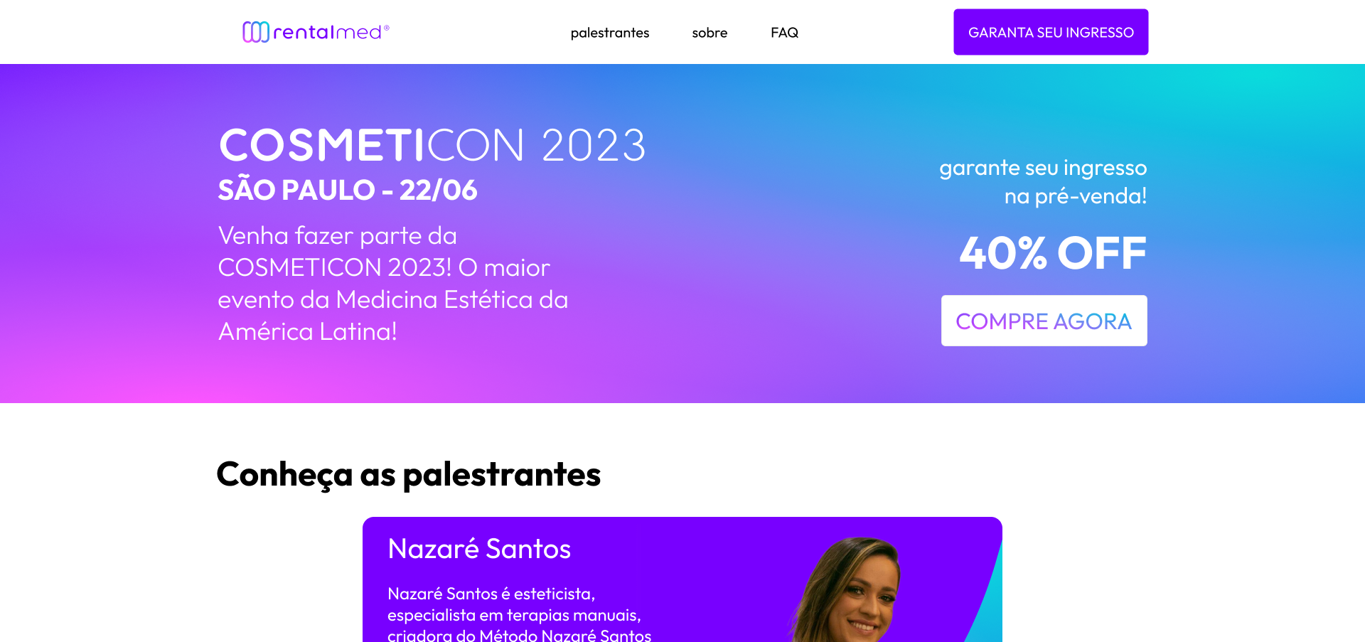
Cosmeticon 2023 is a redesign proposal for a medical convention website, bringing clarity to a content-heavy page without losing essential information.
The project focused on restructuring information, improving visual hierarchy, and making registration effortless across desktop and mobile.
Design Challenges
The original site packed a large amount of information, event details, speakers, schedule, pricing, registration, into a layout that lacked hierarchy, making scanning difficult.

The convention website had to serve multiple purposes: promoting the event, introducing speakers, displaying the schedule, and processing registrations, but the existing layout made it hard for visitors to find what they needed quickly.
The redesign focused on three goals:
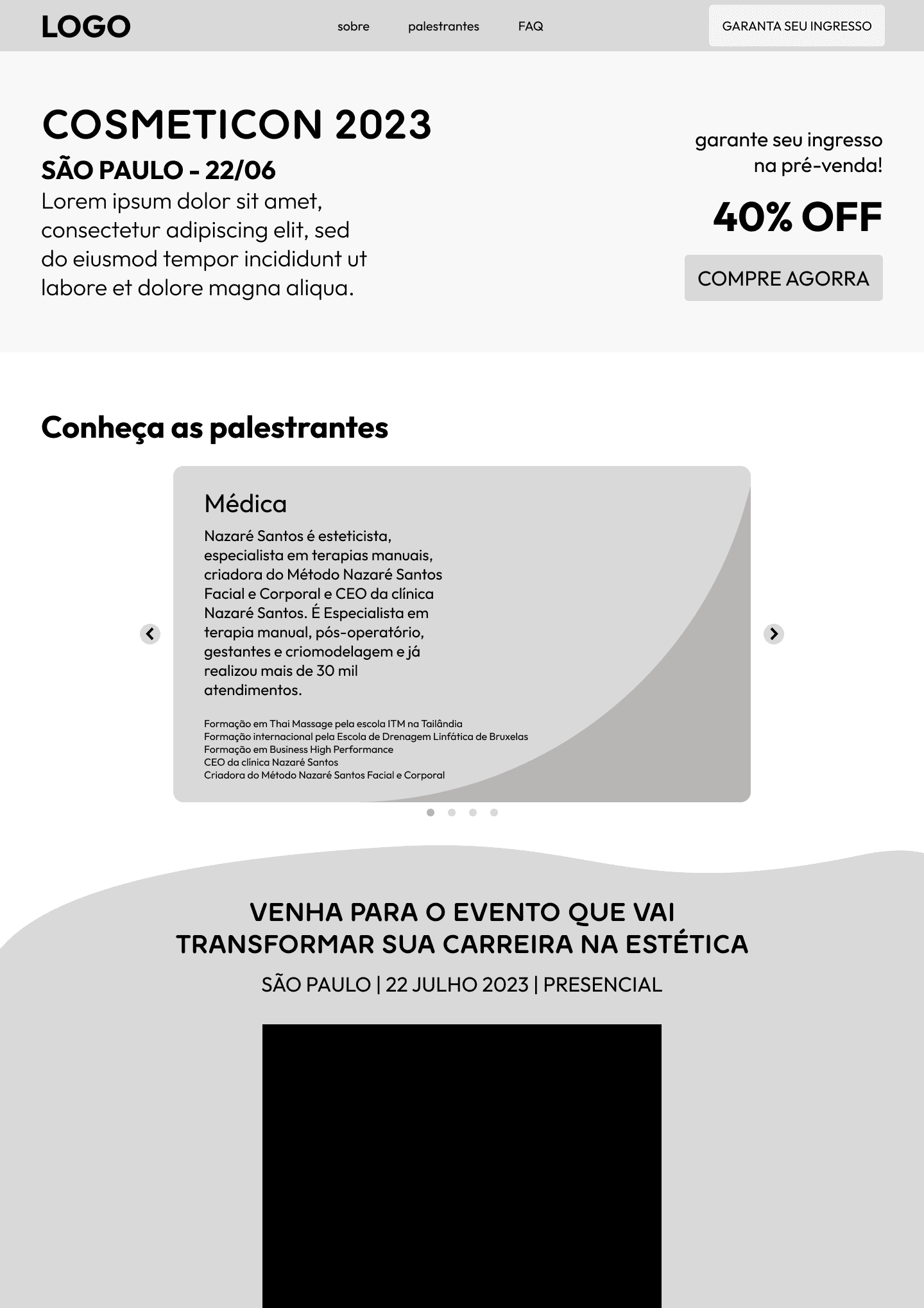
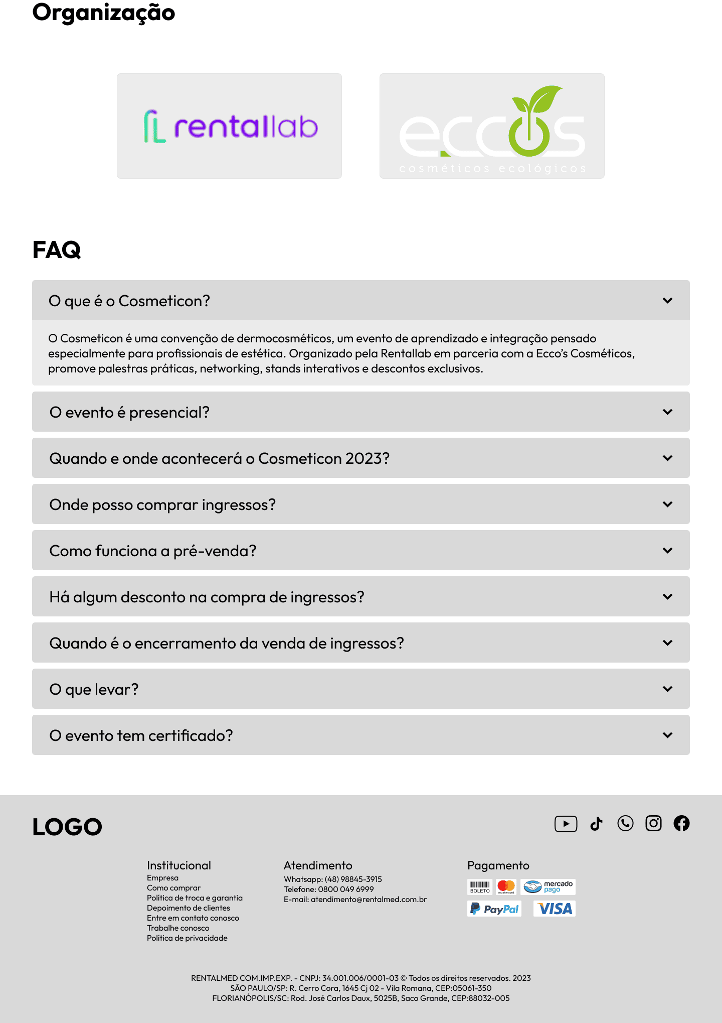
I started by auditing the existing site to identify usability issues and content that could be better organized.
Wireframes quickly mapped a new information architecture, prioritizing key actions while keeping all original content intact.
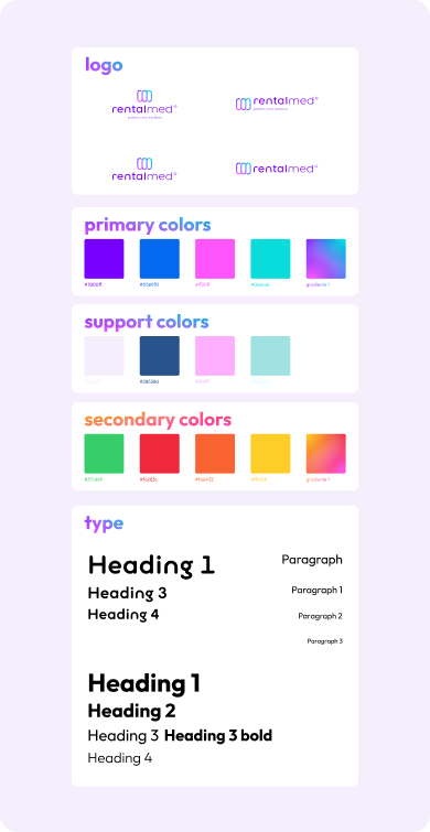
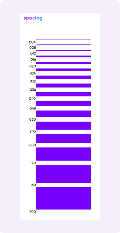
Visual design then brought clarity through consistent typography, spacing, and subtle color cues — giving each section a distinct role without losing cohesion.
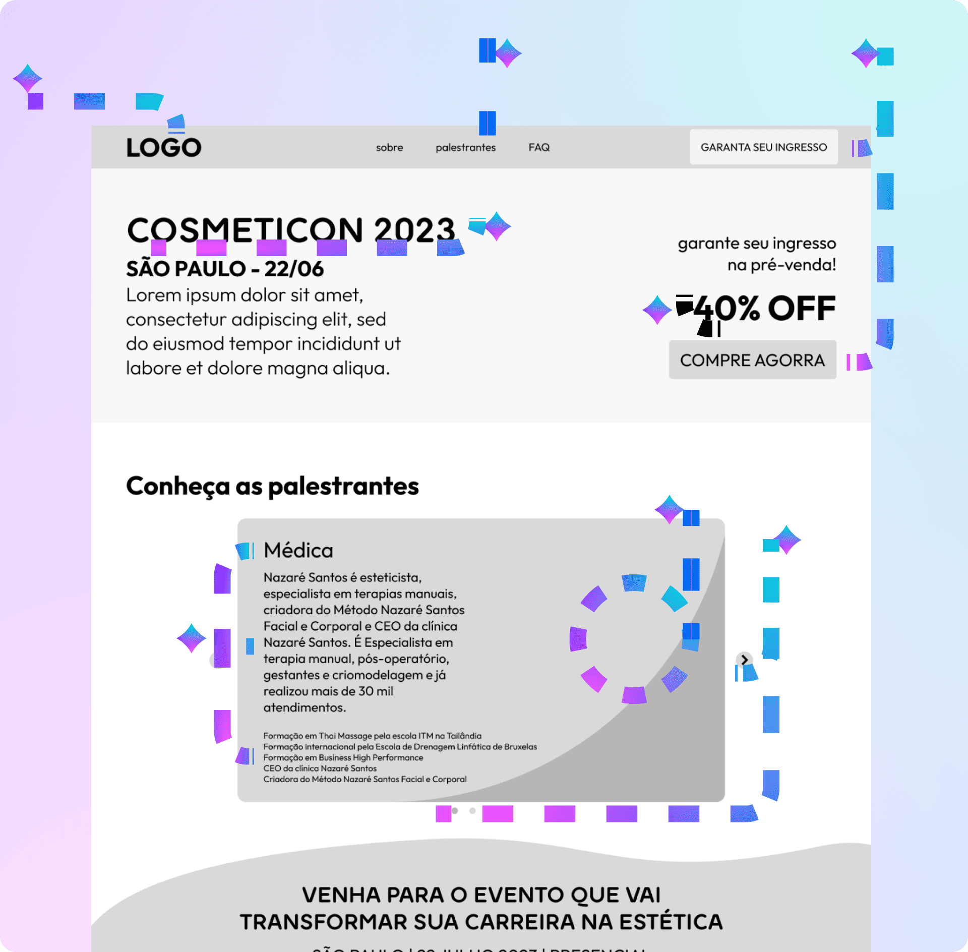
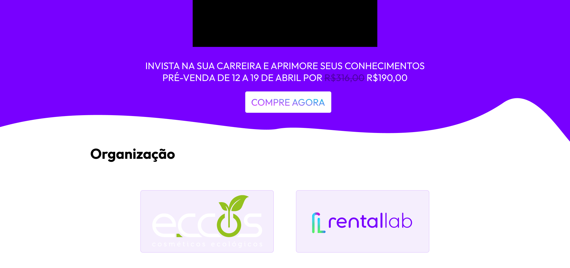
The page was divided into clear zones, each serving a single purpose, so visitors could scan the event from introduction to registration without friction.
Generous whitespace and a consistent typographic scale gave each section room to breathe, while visual grouping made even dense information feel approachable.
The same logic scales naturally to mobile, where stacking content preserves hierarchy and keeps calls to action always within reach.
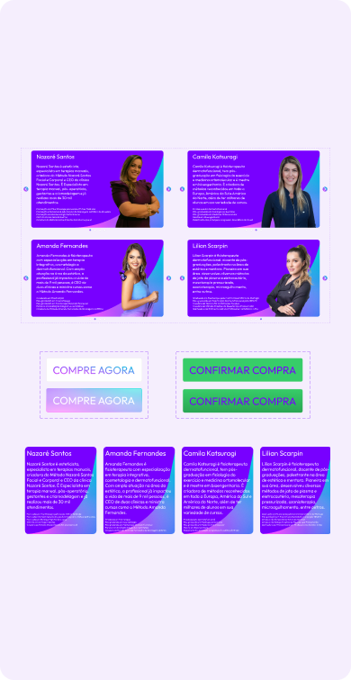
The result is a single scroll that tells the event's story while letting users act whenever they're ready — without ever feeling pushed.