Overview

role:

ux/ui designer

graphic designer

front-end dev

timeline:

6 weeks

tools:

figma

photoshop

illustrator

html/css

type:

branding

marketing website

client project

responsibilities

brand strategy

information architecture

wireframing

ui design

prototype

design system

visual identity

responsive design
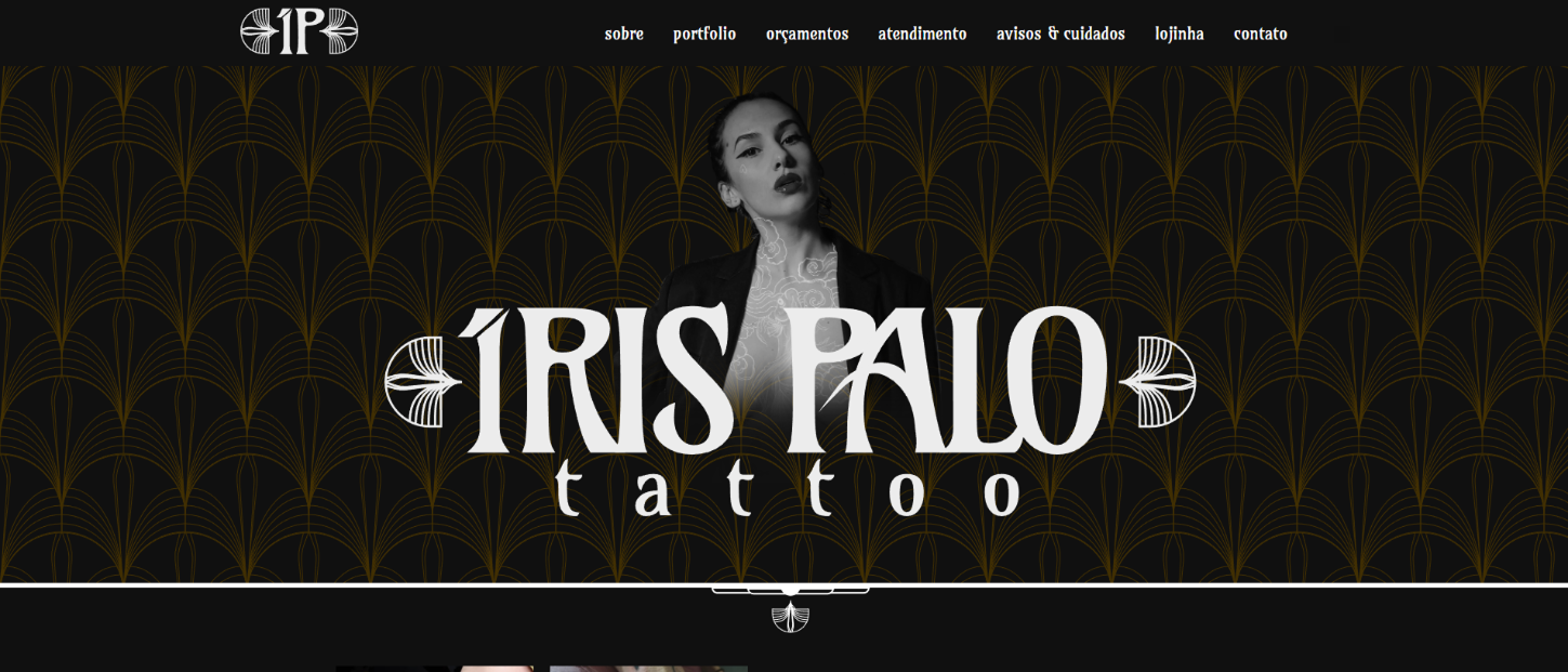
Building a cohesive digital identity for an independent tattoo artist

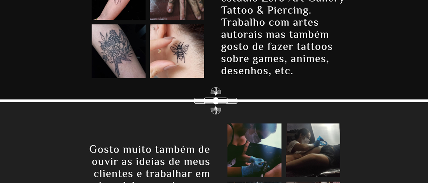
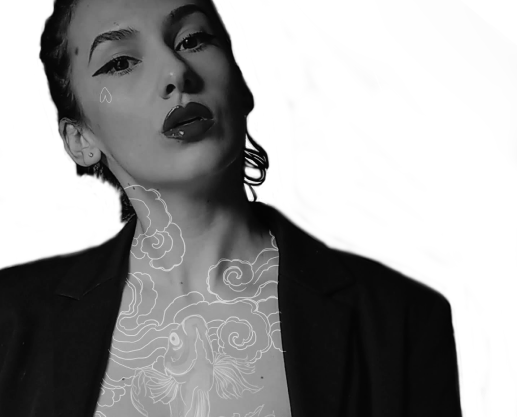
Íris Palo needed a visual identity and portfolio website that reflected her illustration style while making it easy for clients to understand her process and book appointments.

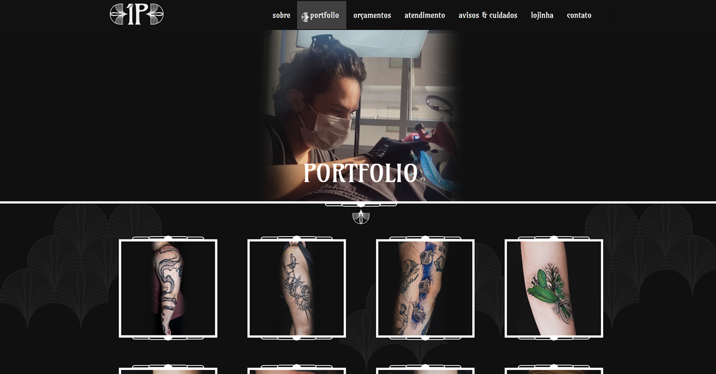
The project combined branding, UX/UI design, and front-end development, creating a consistent experience from the custom logotype down to the responsive layout, with the artwork always kept at the center.

  • Expressive brand that feels handcrafted.
  • Clear navigation for discovery and bookings.
  • Fully responsive portfolio site.

Design Challenges

The main challenge was balancing strong visual personality with a professional, easy-to-use interface. The site had to feel artistic without sacrificing clarity.

  • Making the artwork the hero while keeping the site usable.
  • Building a brand that could live across social media, print, and web.
  • Translating the artist’s voice into a coherent digital system.
  • Ensuring the booking flow felt natural, not pushy.

The Challenge

Íris was relying mostly on social media, which made it hard to communicate her full process, services, and brand personality in one place.

The website needed to serve double duty, a striking portfolio and a practical business tool, without the two roles competing for attention.

  • Showcase the artwork as the primary focus.
  • Educate visitors about the artist's process and style.
  • Provide a frictionless path to booking.

Design Approach

Instead of following the minimalist tattoo studio trend, the visual language grew directly from Íris's illustrations — organic shapes, decorative details, and a hand-drawn feel that makes the brand instantly recognizable.

Branding and UI were developed together, so every color, icon, and layout decision reinforced the same artistic direction. This kept the site from feeling like a template with a logo pasted on top.

  • Built around the artist's existing illustration style.
  • Brand and UI evolved as a single system.
  • Decorative elements used purposefully, not just for decoration.

Brand Identity

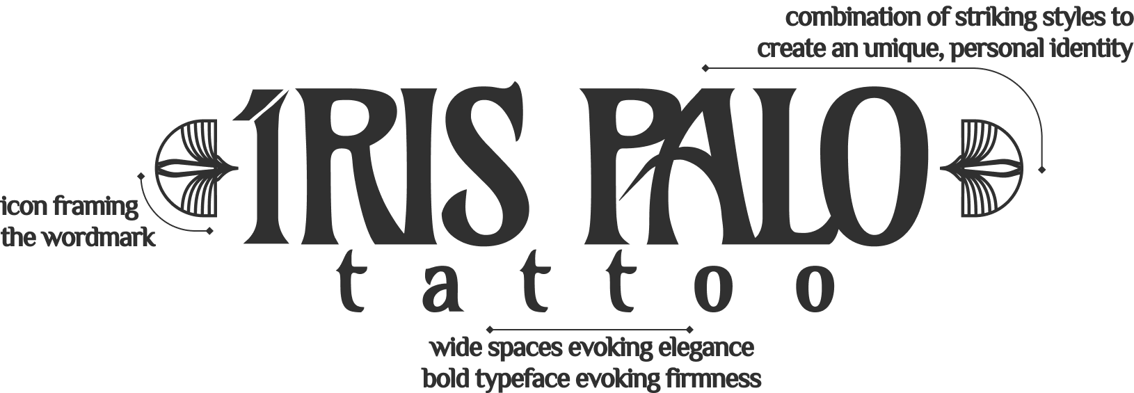
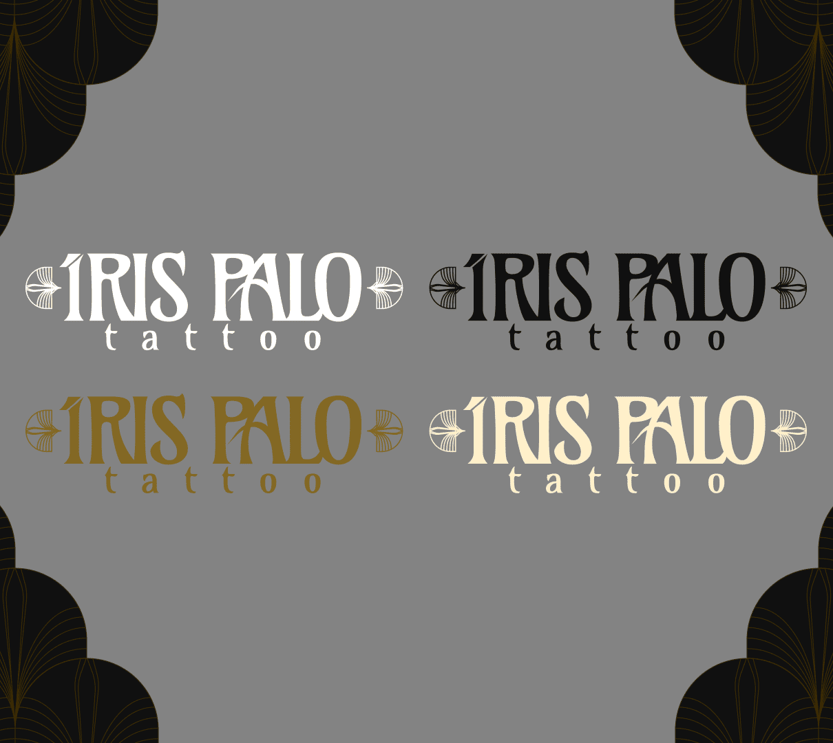
The custom logotype was drawn letter by letter to create a mark that feels as personal and crafted as the tattoos themselves.

Typography and proportions were balanced so the wordmark stays readable at small sizes while still carrying the ornamental character that sets the brand apart.

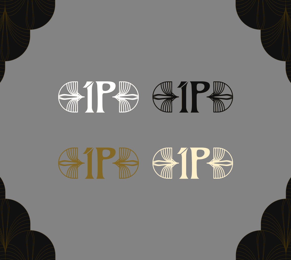
Multiple logo variations were created for different surfaces, website headers, social media avatars, printed collateral, and promotional assets, giving the brand flexibility without losing consistency.

Horizontal, stacked, and icon-only versions make it easy to keep the brand recognizable across any format, from a tiny favicon to a full-width banner.

Design System

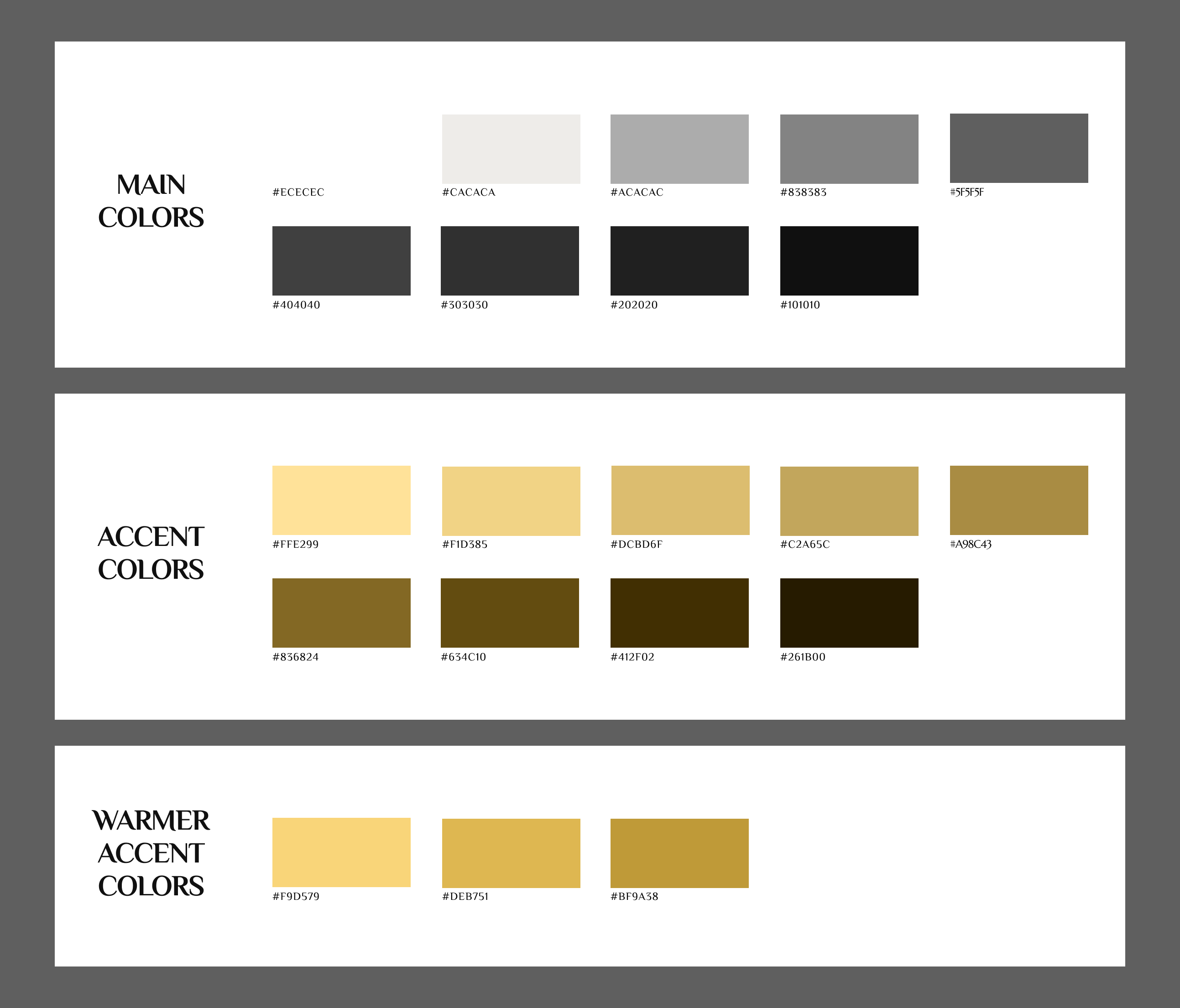
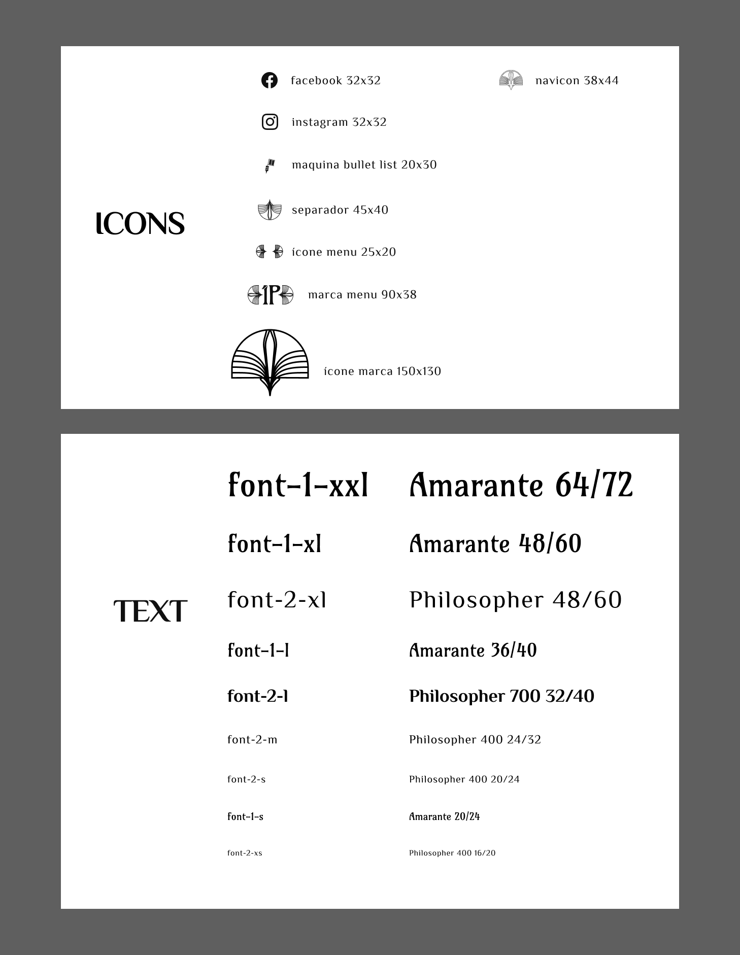
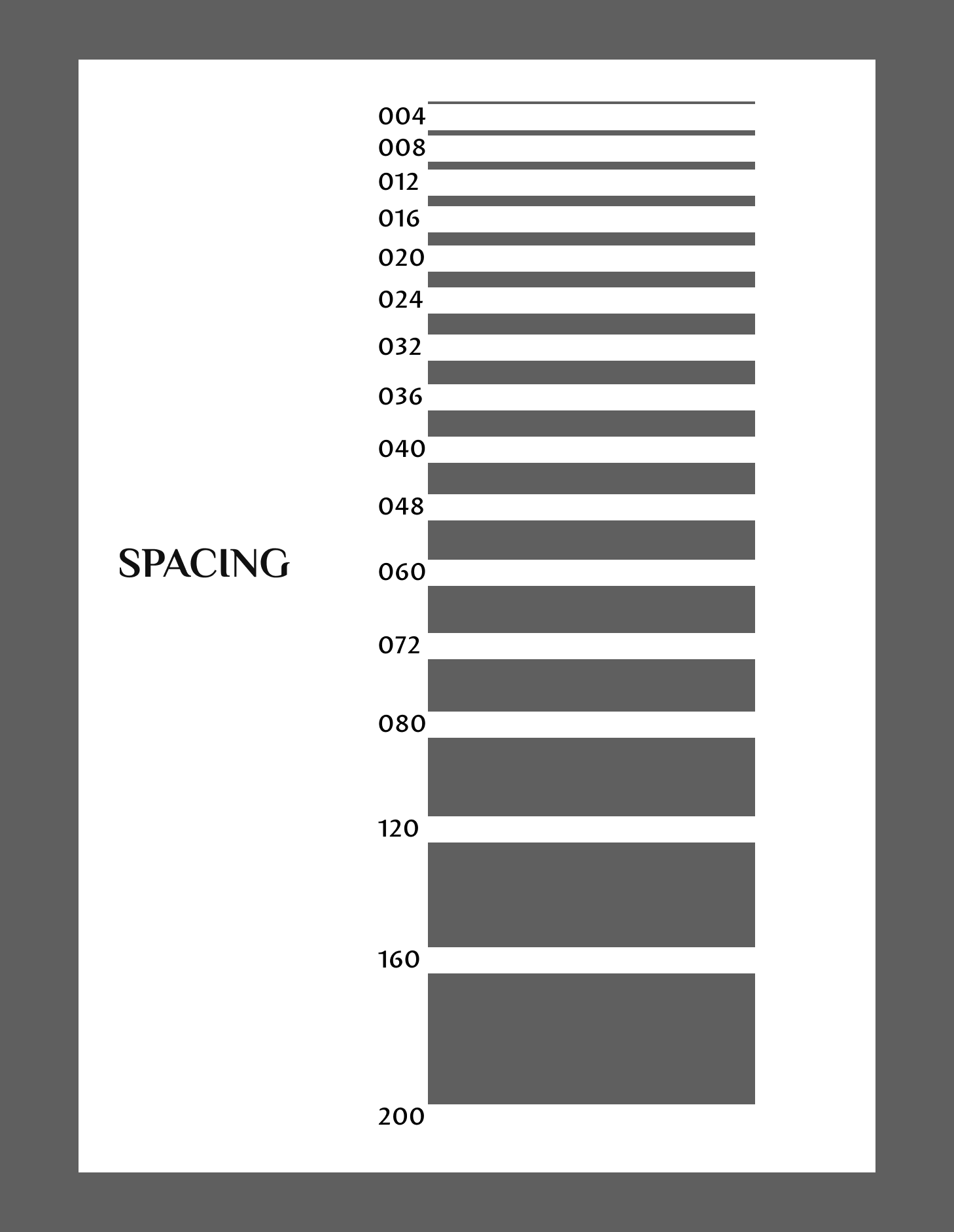
A compact design system was built alongside the brand to keep the website cohesive and easy to extend later.

  • Color, typography, and spacing tokens tied directly to the brand.
  • Reusable UI components (cards, buttons, dividers).
  • Ornamental assets that reinforce the identity without distracting from the artwork.

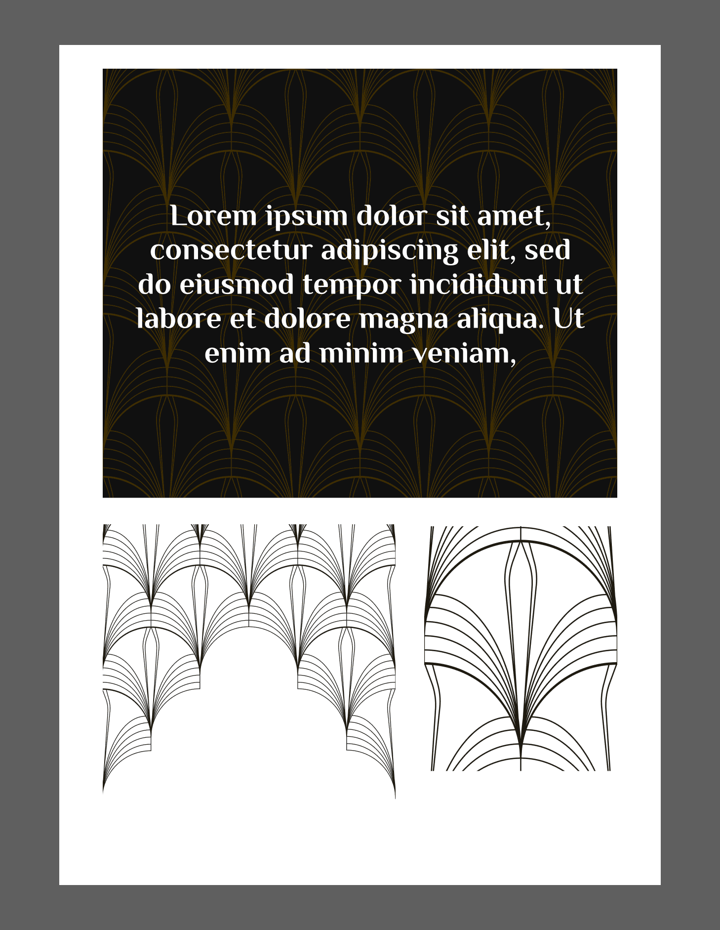
Illustrations and graphic flourishes were drawn from the logo itself — organic lines and art deco inspired details, so every decorative piece felt native to the brand, not an afterthought.

Web Design

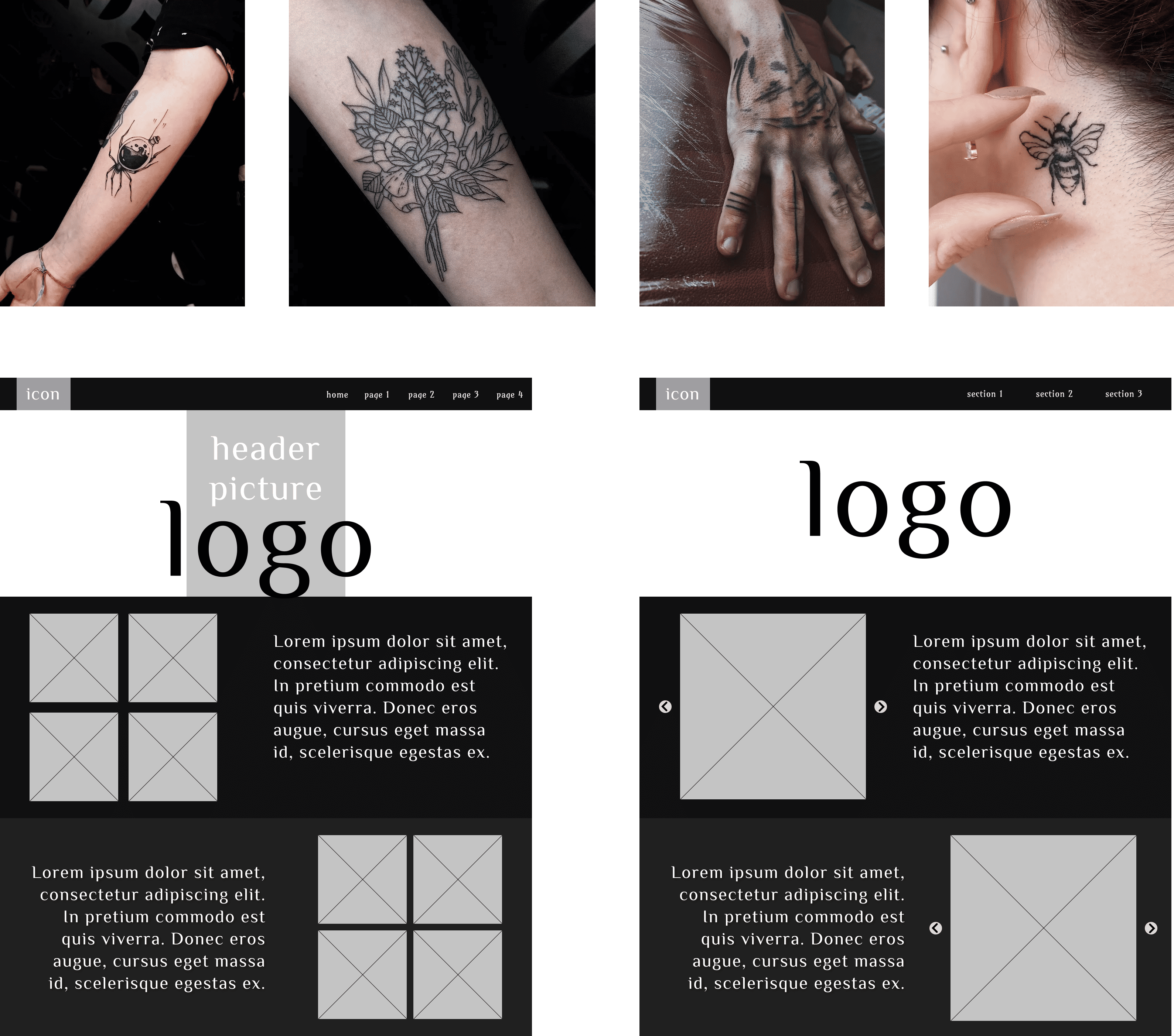
The site leads visitors through a natural journey: discover the artist, explore her work, understand the process, and book a session, all without clutter.

  • Full-width artwork and generous whitespace keep the focus on the tattoos.
  • Clear content hierarchy answers common questions before they're asked.
  • Subtle interactions add polish without distracting from the portfolio.

The final result is a unified digital presence where branding, interface, and code all speak the same language — professional yet personal, and built to grow with the artist.

All Projects