role:
ux/ui designer
graphic designer
timeline:
8 weeks
tools:
photoshop
illustrator
type:
branding
client project
responsibilities
brand strategy
visual identity
packaging design


role:
ux/ui designer
graphic designer
timeline:
8 weeks
tools:
photoshop
illustrator
type:
branding
client project
responsibilities
brand strategy
visual identity
packaging design
Creating a distinctive identity for a game day exclusive beer
Majestosa is a branding project commissioned for a beer planned to be sold around Heriberto Hülse Stadium, home of Criciúma Esporte Clube. The objective was to create a visual identity that captured the club's heritage, strengthened the product's connection with supporters, and established a memorable presence within the match-day experience.
The project covered the complete branding process, including logo design, custom typography, packaging, and a scalable visual identity system. Every element was developed to create a premium product that felt authentic to the club's culture while remaining commercially distinctive.
Although the identity was fully designed and approved, the product was ultimately not released due to budget constraints following changes to the client's plans.
Project Scope
This project included:
The challenge was to develop a product that supporters would immediately recognize as part of Criciúma's culture without relying directly on the club's official branding. The identity needed to balance emotional connection, premium positioning, and practical application across packaging and promotional materials.

The identity was built around three core ideas:
Rather than reproducing Criciúma Esporte Clube's visual identity, the brand draws inspiration from symbols closely associated with the club, its supporters, and the city itself. This approach allowed the product to establish its own personality while remaining instantly recognizable to its audience.
The design process prioritized authenticity, creating a brand that felt naturally connected to the match-day experience and the traditions surrounding the club.
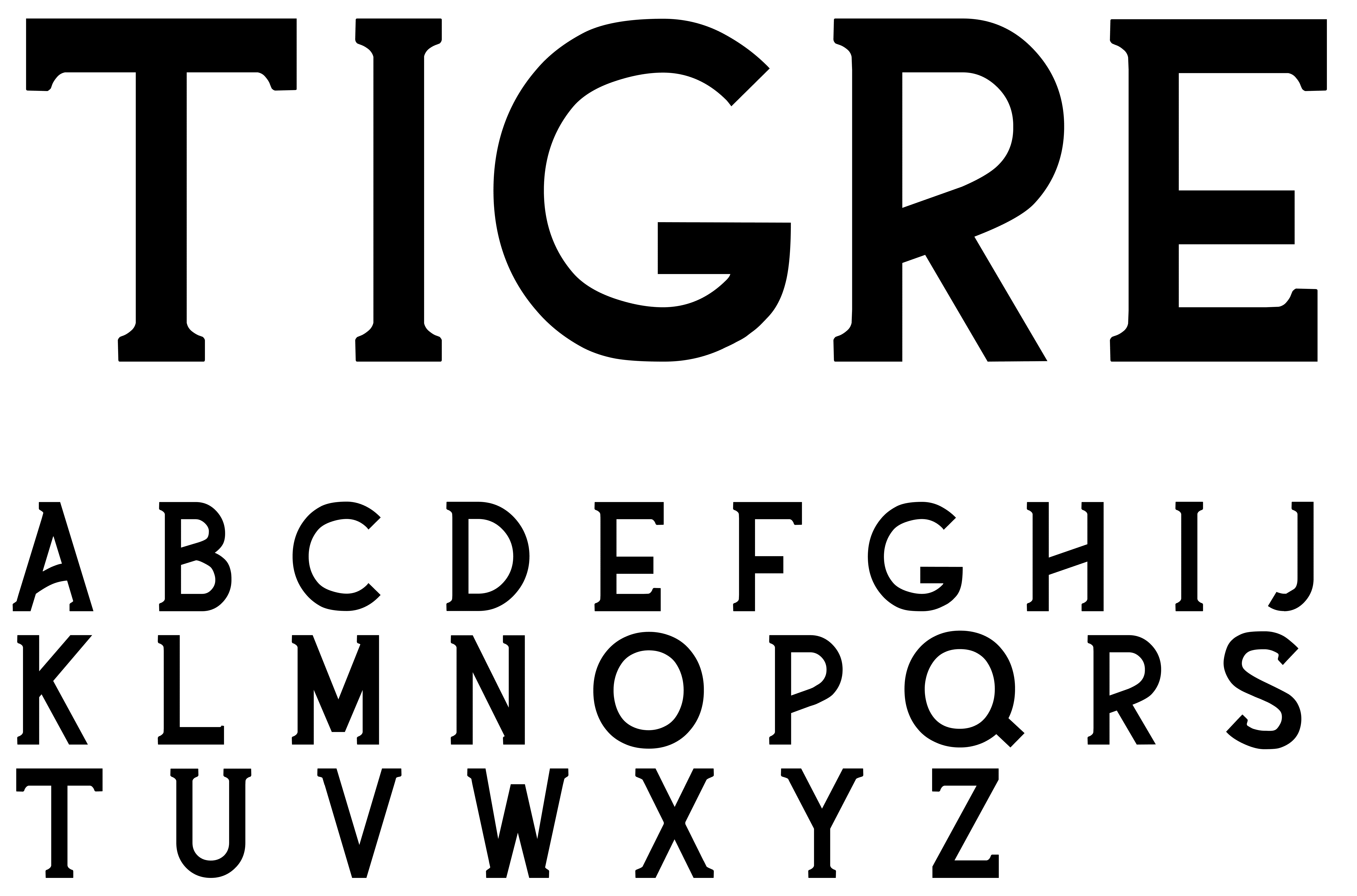
A custom display typeface was developed specifically for the brand to reinforce its unique identity.
Inspired by the atmosphere inside Heriberto Hülse Stadium, the letterforms feature bold proportions, sharp serifs, and compact spacing, creating a distinctive visual voice that performs consistently across packaging, promotional materials, and merchandise.
The custom typeface became one of the identity's primary brand assets, strengthening recognition beyond the logo itself.

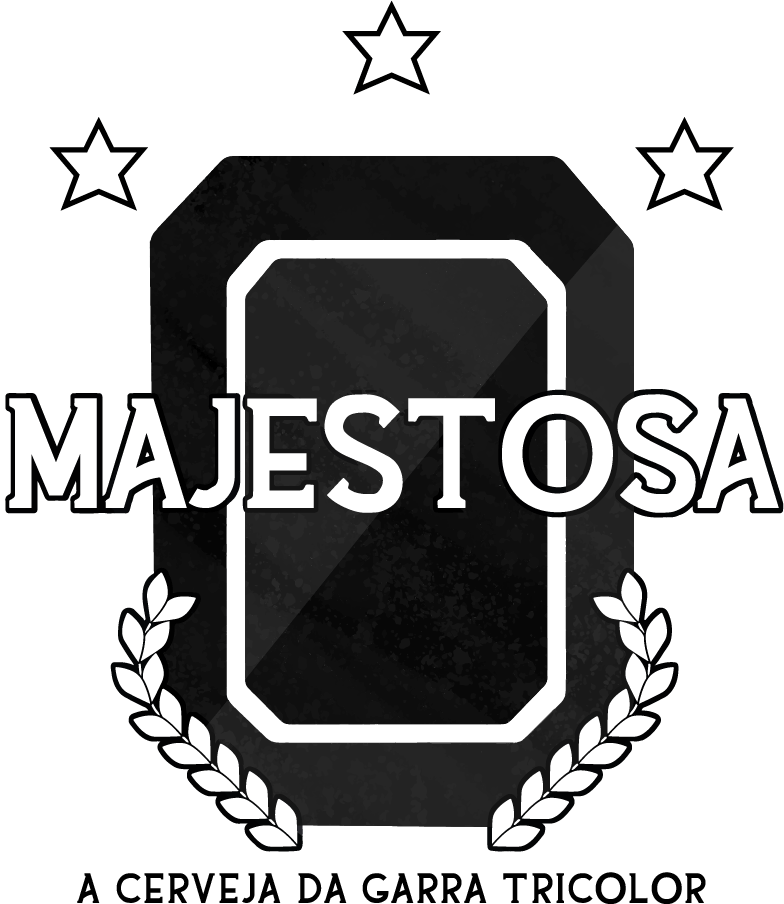
The primary symbol was derived from the aerial silhouette of Heriberto Hülse Stadium, transforming one of the club's most recognizable landmarks into the centerpiece of the brand.
Architectural features of the stadium were simplified into a clean geometric mark, while a charcoal-inspired texture references Criciúma's mining heritage, connecting the product to both the football club and the city's history.
Architectural features of the stadium were simplified into a clean geometric mark, while a charcoal-inspired texture references Criciúma's mining heritage, connecting the product to both the football club and the city's history.

The visual identity combines black, white, and yellow to create immediate association with Criciúma Esporte Clube while maintaining a bold, premium appearance.
Supporting elements—including commemorative stars, secondary graphics, and multiple logo variations—allow the identity to adapt across different formats while preserving consistency throughout the brand system.


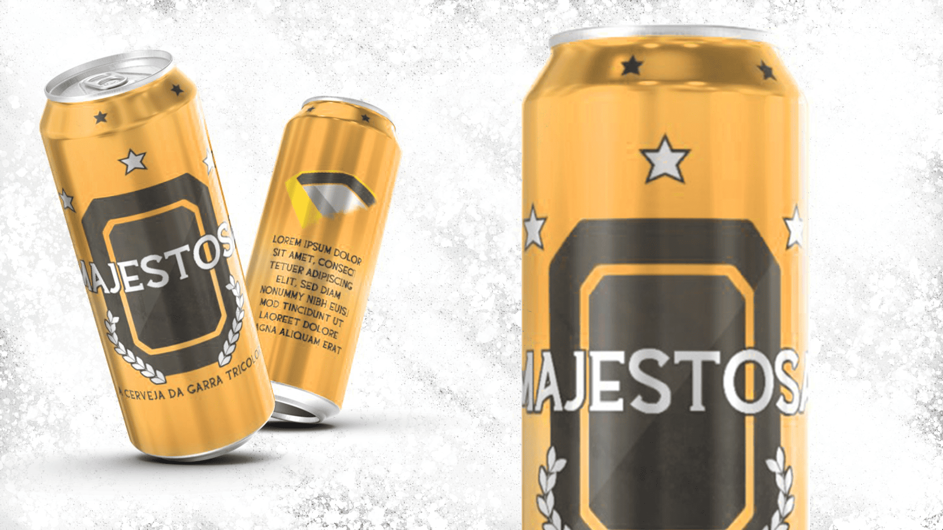
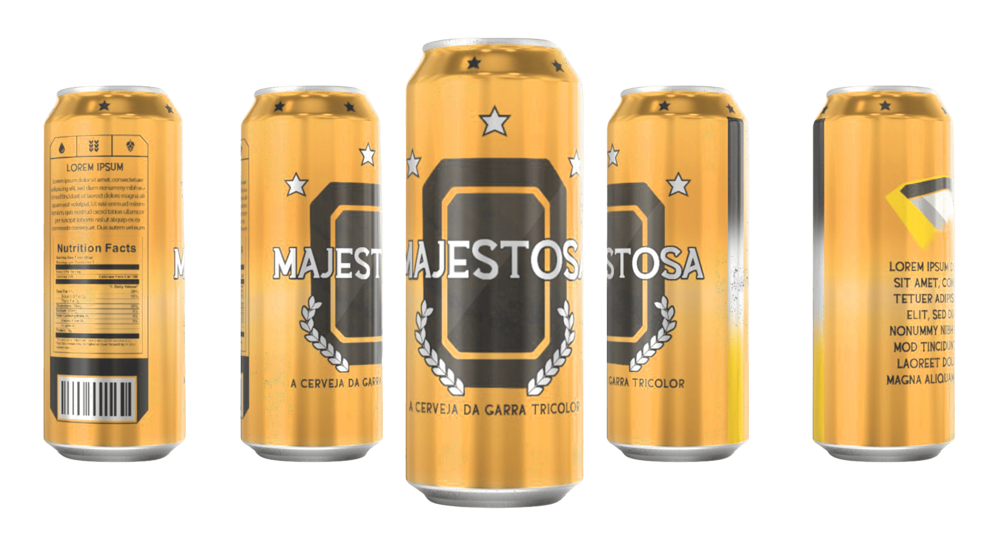
The identity was developed with production in mind, applying the branding system across beer cans, labels, and promotional materials.
Different logo configurations and layout variations were created to ensure flexibility across print applications while maintaining strong brand recognition at every scale.
Although the product was ultimately not manufactured due to budget cuts, the project was completed as a fully realized branding system ready for production.